Friday, May 5, 2017

Special Edition Post - Art Institute

For this week's assignment, we were asked to chose one masterpiece and one disaster piece from the tour that was given to us.


I chose this one has my masterpiece. The first thing I noticed about it was the precision making of all those indentations, grooves, and slots. Having been able to create figures in this almost metal looking material with such fine visual representation is incredible. The amount of craftsmanship is clearly evident in this piece. the mass and volume given to the tress and mountains gives this piece a sense of three dimensionality.


This piece is the one I chose as the disaster piece. Even now, I cannot understand as to why this would be in the art institute. I could understand that it holds tremendous sentimental value to the artist being that its a tribute to someone close to them but candy as a form of art is barely scratching the surface. It something that questions the idea as to whether drawing a straight line is art or not. I also thinks because it gets replaced continuously that it loses value because at that point, its just candy and not truly art.

Week 15 - Final Project Part 4 (Completion)


This week we had to have had the assignment completed. I managed to incorporate all four of the elements that we were require to use. Each photo has a different color to help individualize each section but to also help identify key elements that tie the story together. The first image has the colors of the flag with the text sitting on top of the flag following its path. There is also a stencil of the veteran on the bottom right. The second photo has red on the gun to help associate the gun with blood. this helps ties the image to suicide besides the figure itself. The third image is jesus and he is purple. The stencil of the purple heart sits on top of the purple to indicate that its a purple heart but also of death. If I could change something about it, I would change the third image to my original sketch because it seemed to make much more sense in terms of the other photos. Having an image of Jesus created a disconnection between the other photos.

Week 14 - Final Project Part 3 (Work Day)


This week's assignment was to continue working on our final project to get it as close to done as possible. I only managed to make the stencil's for each photograph. This process was different for me because in the previous stencil assignment, I made a stencil using adobe illustrator whereas in this work time, I had to make stencils using Photoshop, which I was still unfamiliar with. The Purple heart and the veteran with his hands on his face were made in Photoshop plus illustrator. The figure with the gun to his head was made using pen tool on adobe illustrator. I was really fascinated as to how there are different approaches to making stencils, both having pros and cons. You can easily make a stencil on Photoshop but it includes every little detail. You can be as simple or as intricate as you want on illustrator but it is definitely much more time consuming.

Week 13 - Final Project Part 2 (Photos)


Craft: This week's assignment was to take photos for our final project. The purpose for taking photos is because we are required to include four elements in our final project, which are illustrator, photoshop, paper cutter, and photography. I decided to take the topic literally and take photos closely representing any war related. 

Concept: The idea was to find a way to connect all elements that I described before into a set of three. I had to take into consideration which images would go well with my drawings. 

Composition: I used the flag because its the simplest representation of the united states of america and it can also be a representation of how the US is being protected by our soldiers. This photo will pair with the veteran with his hand on his face, almost can be seen as an oxymoron (saving the U.S. but can't be saved from their depression). I used the gun as the second photo paired with the stencil of the veteran who is ready to pull the trigger to end his life. Showcasing the gun as the central object in relation to the veteran. I used Jesus as the third photo paired with the purple heart to showcase that the veteran has committed suicide leaving behind only relicts of his past.

Week 12 - Final Project Part 1 (Sketches)


Craft: For this week's assignment we were required to make sketches for our final project, which would be a triptych of a topic chosen by the class. Our topic was war. We were to  develop sketches around or with the topic of war. he possibilities were endless because war is a topic that can be taken figuratively or literally. I chose to do something literally. My sketches were depicting the life of a veteran and his journey to suicide. I used a photo reference to get the sketches.

Concept: I decided to use veteran and suicide as my topic because it is not a topic regularly discussed by many. The biggest misconception is that suicide is not common among veterans but studies show that there are higher rates of suicide among veterans yearly. I cannot connect to this on a personal level but I found it interesting that this topic is discussed as widely as teen and depression suicide.

Composition: or my triptych piece, the first image is a veteran with his hands to his face slightly bending forward. The second image is of him pointing a gun to his head, and the third image is of his hands, one with a purple heart medal and a gun in the other. I thought this order would be best to accurately display the sadness of a veteran outside the army, nav, marines, whatever it may be.

Week 11 - Stencils Part 2


Craft: This week's assignment was to create a stencil based on what we were taught last class. I decided to use one of my previous drawings, which is a time octopus, to use as my stencil. Instead of using photoshop, I would use adobe illustrator to create the individual shapes of the different parts of my time octopus. The most important thing is to fill the shapes and choose whether or not you want them to connect. For this particular assignment, I decided to make a perfect stencil and color stencil. Saving the file as a JPEG and then transferring that file tot he shilhoutte studio application is also another important. That application is to convert any JPEG file into a stencil.

Concept: Knowing how to make a stencil is a process but actually beginning the process to cut it was another. This time, we are familiarizing ourselves with the silhouette cutter. Adjusting the blade setting is probably the most important step because it can eratically alter the results due to sharpness of the blade and how much pressure it puts on the material being used.

Composition: This stencil is simple and can be re-created easily. It has no intricate angles and follows a direct path that the silhouette cutter can follow without a problem. I chose this because I wanted to make alterations to the design I had made previously, by playing with color and adding some additional detail.

Week 10 - Stencil


Craft: This week's assignment is to create a stencil using photography. In order to do that, we must use the Photoshop application. After opening the photo, I used the quick selection tool to elect sections of the photos I wanted to be outline and those outlines would be used to create the stencil. After that, I desaturated the sections I selected and created a duplicate layer. Then I used the threshold to flatten any detail within the selected sections and make them completely black. I would then save the photo and transfer it the adobe illustrator, where I would trace the image. The last step would be to make and expand the image and thus a stencil is born.

Concept: This exercise was to familiarize ourselves with basic instructions on how to create stencils. To understand the challenges of creating stencils of different space to subject relationship. How big or how small the subject is in relation to the space its in can affect the outcome of the stencil.

Composition: I chose to use simple plant to demonstrate the functions of converting an image to a stencil. Its very impactful to isolate any desired sections of a photo because its easier to draw our attention to one section but still be able to connect the entire thing together.

Week 9 - Space


Craft: We are require to take photos that represent space within a three dimensional platform on a two dimensional format, which is photography. The only tool that can be used for this particular assignment is a camera.

Concept: The purpose of this assignment is to perceive spaces based on varying viewpoints. Background, middle foreground, and foreground can vary in space, depending on what angle its seen. Changes in angles can significantly affect how something is seen, such as seeing something from the sky can make everything appear flat and two dimensional whereas something seen from a rooftop can appear to have a physical form in terms of mass and volume.

Composition: I was interested in taking photos where space is represented as almost never ending. Having flexibility within space in a two dimensional format creates the illusion of three dimensionality. and being able to translate that sort of information is vital when creating art or producing photos where space can be impactful.

Saturday, March 4, 2017

Special Edition Post - Barbara Cooper


Barbara Cooper is a sculpture artist. One thing she emphasized the most was her strong connection with nature. She cares for the growth of nature and its role in the environment. She finds a lot of interest in abstraction of nature, how it was distorted through uncontrollable circumstances, such as a tornado hitting a forest. She takes irregular patterns and transforms them into something different without losing its essence of where it came from. This is her way of taking organic trash and giving it life again.

She focuses on erosion, how the variant shapes and lines were formed or essentially distorted or destroyed by a naturalistic phenomena.

The first two photos on top are an example of her using organic trash to make a nature related sculpture. The wood itself is incredibly thin but she didn't want to worry about that because she wasn't trying to put her entire focus on the flexibility of the wood but its strength, which is why her pieces primarily consists of layers upon layers upon layers, which emphasizes that strength. It almost seems like something that belongs in nature because it seems as though the work itself was developing almost a "tree tumor" but it's clearly manipulated by the artist.

The Bottom two photos are her showcasing this idea of 2-D implying 3-Dimensionality. The second to last photo is known as her contour map. It is map that she drew on because she wanted to give it a sense that a place with such an irregular pattern existed. She used something I believed was called walnut ink to add those ripple patterns on that map. Same goes for the bottom photo, using irregular lines to create depth and 3-Dimensionality.

Barbara was really interesting to listen to not because she was an artist but because she was interested in irregular patterns. She examines a wide range of patterns and incorporates these ideas into an naturalistic sculpture. It's steps further from clay sculpture. Her method definitely conveys this idea of reparation, almost considering the feelings of the art and the viewer.

Week 8 - Contrast and Unity


Craft: I used a canon camera and adobe photoshop to create these images. The purpose of this assignment was to understand that photos can be manipulated to seem much more interesting, such as adding effects or even a stroke and we must be able to use those effects so that they work in unison with other components within that manipulated photo. I took photos of a jar of marbles, full, half- empty, and empty. I started by making the images black and white. Soon after I de-saturated the color to create a subtle contrast. I then used the elliptical and polygonal marque tools to create distinguishable shapes. I then added a stroke and drop shadow. I tried to have different opacities and or thickness of the stroke and drop shadow to be able to tell a narrative but these images aren't a good representation of that. Lastly, I added text that would flow smoothly throughout the photos, continuing the narrative pattern.

Concept: One of the things I was trying to accomplish was consistent unity. It was important to consider color as well as subject. I wanted to showcase a city that was full of life and was progressively losing that peace of mind. The first image shows a moon, using the marbles to show moonesque features that resembled a moon as well as the city. Slowly the moon losses its life along with the city, almost losing its "fullness", as well as using the color and shapes to tell a ominous narrative, with the words stating "fading peace of mind" to tie everything all together.

Composition: One of the most important things I had to considered was what shapes to use that would work well with de-saturated colors. The best I could think of was a city skyline because you could experiment endlessly with a skyline to get many interesting results. The gray that sits on top of the image also helps us to visualize that city at night. Different saturations for each image would have been better to help make the story clearer as well as the use of different effects but it works well.


Friday, March 3, 2017

Week 7 - Solid, Pop, and Super pop


Craft: I used a canon camera to produce these photos. The purpose of this assignment was to understand the importance of editorial functions that could make photos much more dynamic. I took photos of marbles and decided to make three different but similar edits. I took three different photos of different subjects and make three different edits. I took three narrative style photos and made three similar edits. All of these edits were made using Adobe Photoshop. I used different functions of that software, such as the marque tool and lasso tool, which are both used to create a section within the photo that we would like to edit. The usage of layers was also critical because it allowed for easy and quick maneuvering between the different edits all within the same photo.

Concept: There are no themes in regards to the photos that I chose to use. It was more of an experiment to be able to understand how changing the color scheme of a photo could make it much more interesting, which ties us back to contrast, such as having two significantly different colors in order to be able to make one thing stand out in a photo where there are multiple things. This can also be done to be able to draw the viewer's attention to just one part of the photo instead of viewing the entire photo.

Composition: Many of these photos contain different elements that make them interesting in their own way but the one that interests me the most is the photo with the boomerang style pattern. You get one effect when you isolated one part of the photo when its side by side to another thing but its different when the subject overlaps other things. You're able to see how well they work with the other components of the photo and its easier to see the impact of that change.

Monday, February 13, 2017

Week 6 - Contrast Photos


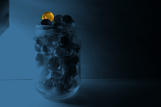
Craft: I used a canon camera to produce these photos. The purpose of this assignment was to understand the use of contrast and how vital it becomes in regards to setting the dynamics in a drawing or photo. We needed to take photos of a subject of our choosing, representing different forms of contrast. I chose to take photos of marbles in a jar and I decided to take them in the same location. I used different "sides" of the jar in hopes that the pigment of the color and whatever transparency each marble allowed would significantly or even slightly affect the contrast.  

Concept: I don't know much about how light and glass works but It could be safe to assume that color significantly affects how light is reflected or refracted since color is involved as oppose to starting with a subject that is black and white. In the jar of marbles, it has been coincidentally split in between marbles on the warm side of the scale going up to the cool side of the scale. I noticed this because the warmer colored marbles seem to stand out the most when in warm lighting and cooler colored marbles in cool lighting.

Composition: These photos were taken using artificial lighting because I wanted to be able to manipulate the light. I feel as though natural lighting would only give me a subtle contrast, which could be achieved using artificial lighting. A white background was also necessary to be able to see how much of the value scale is shown in each photo, such as how the marble jar in one of the photos above is almost covered in darkness whereas in another one the marble jar seems to disappear in the light.

Tuesday, February 7, 2017

Week 5 - Color Wheel


Craft: The compositions above were made using oil paints. I used 3 brushes, turpentine, paint, and sheets of canvas paper, especially for oil paints. For this assignment, we were just exploring the realms of color and were discussing the color wheel. We were suppose to produce five compositions, showing the use of monochromatic colors, tertiary colors, complimentary colors, and two of our choice. I chose to draw a flower five times.

Concept: I decided to use a flower for every composition because I wanted to show case the multiple effects colors could have on a subject that is used multiple times. Different colors convey different emotions and sometimes colors can have a different impact to us when seen in comparison to one another. Just by staring at the flowers side by side, you can come to the conclusion that they feel almost ominous because of the color chosen.

Composition: The first three on top were made intentionally, being that they are a recognizable subject, which is a flower. I tried my best to maintain the color purple in each composition to showcase that purple can evoke different feelings based on different values or different colors associated to it. The two in the middle were made with crazier hand gestures to suggest that it was a flower but without looking at the other compositions, it would be difficult to make out what it's suppose to be.