Saturday, March 4, 2017

Special Edition Post - Barbara Cooper


Barbara Cooper is a sculpture artist. One thing she emphasized the most was her strong connection with nature. She cares for the growth of nature and its role in the environment. She finds a lot of interest in abstraction of nature, how it was distorted through uncontrollable circumstances, such as a tornado hitting a forest. She takes irregular patterns and transforms them into something different without losing its essence of where it came from. This is her way of taking organic trash and giving it life again.

She focuses on erosion, how the variant shapes and lines were formed or essentially distorted or destroyed by a naturalistic phenomena.

The first two photos on top are an example of her using organic trash to make a nature related sculpture. The wood itself is incredibly thin but she didn't want to worry about that because she wasn't trying to put her entire focus on the flexibility of the wood but its strength, which is why her pieces primarily consists of layers upon layers upon layers, which emphasizes that strength. It almost seems like something that belongs in nature because it seems as though the work itself was developing almost a "tree tumor" but it's clearly manipulated by the artist.

The Bottom two photos are her showcasing this idea of 2-D implying 3-Dimensionality. The second to last photo is known as her contour map. It is map that she drew on because she wanted to give it a sense that a place with such an irregular pattern existed. She used something I believed was called walnut ink to add those ripple patterns on that map. Same goes for the bottom photo, using irregular lines to create depth and 3-Dimensionality.

Barbara was really interesting to listen to not because she was an artist but because she was interested in irregular patterns. She examines a wide range of patterns and incorporates these ideas into an naturalistic sculpture. It's steps further from clay sculpture. Her method definitely conveys this idea of reparation, almost considering the feelings of the art and the viewer.

Week 8 - Contrast and Unity


Craft: I used a canon camera and adobe photoshop to create these images. The purpose of this assignment was to understand that photos can be manipulated to seem much more interesting, such as adding effects or even a stroke and we must be able to use those effects so that they work in unison with other components within that manipulated photo. I took photos of a jar of marbles, full, half- empty, and empty. I started by making the images black and white. Soon after I de-saturated the color to create a subtle contrast. I then used the elliptical and polygonal marque tools to create distinguishable shapes. I then added a stroke and drop shadow. I tried to have different opacities and or thickness of the stroke and drop shadow to be able to tell a narrative but these images aren't a good representation of that. Lastly, I added text that would flow smoothly throughout the photos, continuing the narrative pattern.

Concept: One of the things I was trying to accomplish was consistent unity. It was important to consider color as well as subject. I wanted to showcase a city that was full of life and was progressively losing that peace of mind. The first image shows a moon, using the marbles to show moonesque features that resembled a moon as well as the city. Slowly the moon losses its life along with the city, almost losing its "fullness", as well as using the color and shapes to tell a ominous narrative, with the words stating "fading peace of mind" to tie everything all together.

Composition: One of the most important things I had to considered was what shapes to use that would work well with de-saturated colors. The best I could think of was a city skyline because you could experiment endlessly with a skyline to get many interesting results. The gray that sits on top of the image also helps us to visualize that city at night. Different saturations for each image would have been better to help make the story clearer as well as the use of different effects but it works well.


Friday, March 3, 2017

Week 7 - Solid, Pop, and Super pop


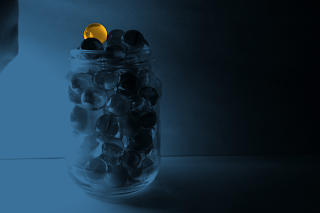
Craft: I used a canon camera to produce these photos. The purpose of this assignment was to understand the importance of editorial functions that could make photos much more dynamic. I took photos of marbles and decided to make three different but similar edits. I took three different photos of different subjects and make three different edits. I took three narrative style photos and made three similar edits. All of these edits were made using Adobe Photoshop. I used different functions of that software, such as the marque tool and lasso tool, which are both used to create a section within the photo that we would like to edit. The usage of layers was also critical because it allowed for easy and quick maneuvering between the different edits all within the same photo.

Concept: There are no themes in regards to the photos that I chose to use. It was more of an experiment to be able to understand how changing the color scheme of a photo could make it much more interesting, which ties us back to contrast, such as having two significantly different colors in order to be able to make one thing stand out in a photo where there are multiple things. This can also be done to be able to draw the viewer's attention to just one part of the photo instead of viewing the entire photo.

Composition: Many of these photos contain different elements that make them interesting in their own way but the one that interests me the most is the photo with the boomerang style pattern. You get one effect when you isolated one part of the photo when its side by side to another thing but its different when the subject overlaps other things. You're able to see how well they work with the other components of the photo and its easier to see the impact of that change.